Our role:
UI/UX Design
Website Development
Proposal Design
About:
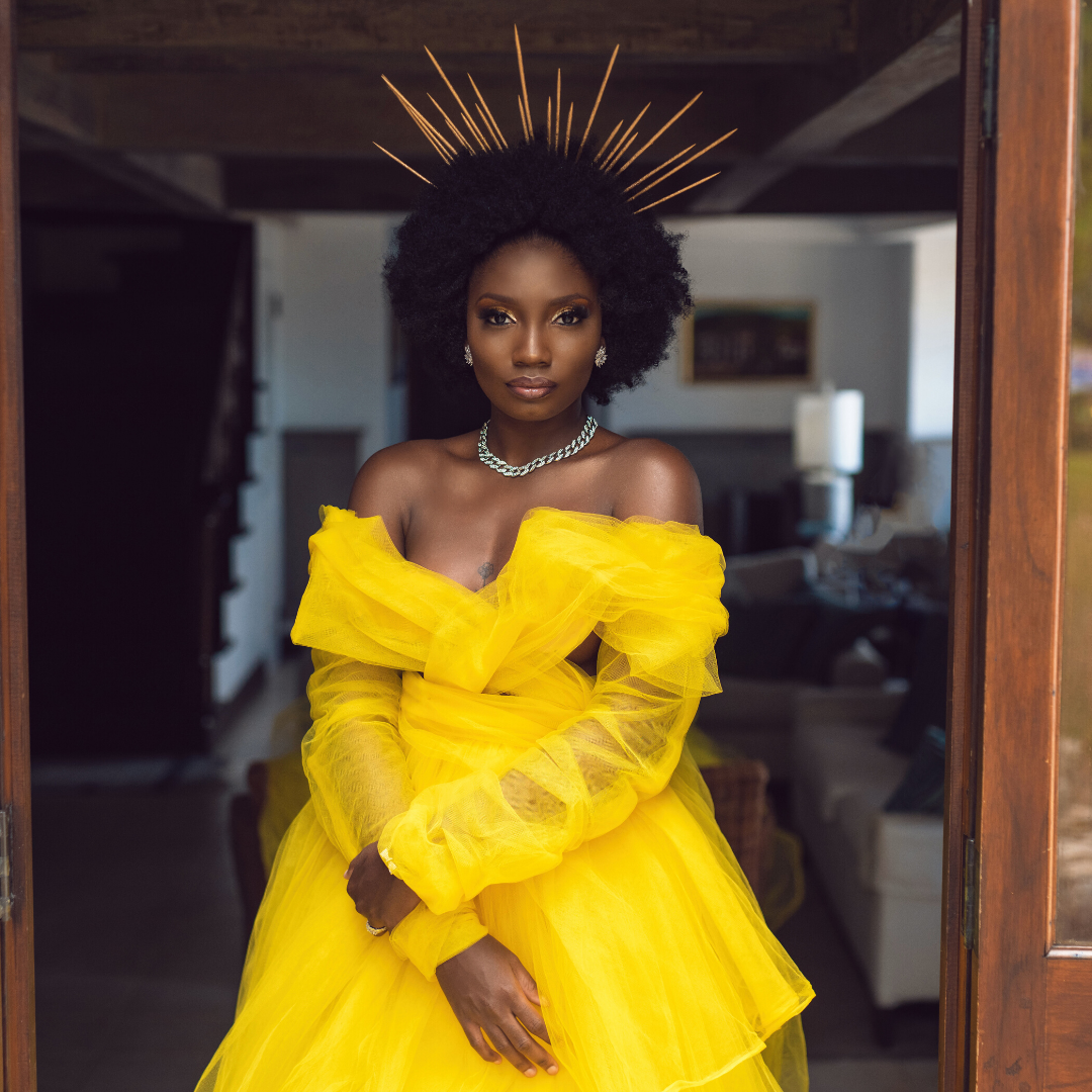
Galería Events is a boutique agency that specializes in producing bespoke weddings and other-worldly experiences for all who are looking to create unforgettable moments. Founded on the belief that a brand is more than just a business, Terrensia Vernon-Francis’s mission is to both expose and highlight the opulence and magic that can coexist, therefore, creating uniquely styled events.

Problem/Challenge:
Galería Events wanted to convey luxury and mystery yet accessibility to its clients. We had to capture both the dynamism of the events they create while conveying a feeling of trustworthiness and ease. Being able to connect intimately to clients was very important to the client.
Project Goal:
The main goal was to capture the hearts of black women and women of color that feel unrepresented in the luxury events world while communicating the services that are offered.
Usability Goal:
Improve discoverability, convey aesthetic, dynamic & minimal design, and highlight visuals while compelling users to fill out a contact form or call for more information.
User goals:
User goals are to find an event planning company that caters to black women and women of color. The user is looking for a brand that is trustworthy, professional and conveys a sense of luxury and peace.

Solutions
It was important to make it easy for prospective clients to contact the brand about their upcoming events. Because Galería Events focuses on creating beautiful experiences, it was also important to create the website that is centered around visuals.
1. The navigation system was created with accessibility in mind. We created two navigation systems, the primary navigation contained the main tabs like “About, Services, etc... while the secondary contained contact information making contacting the business one click away. The main navigation was also made to be fixed so that no matter where the user is on the page, it’s easy to access.
2. Call-to-action buttons compelling users to contact the business were placed strategically on every page so that when a user absorbs important information about the brand, connecting with the brand is only one click away.
3. Keeping the luxury and minimal aesthetic in mind, we limited website copy so that the user does not get overwhelmed with unnecessary information. We wanted to feed users the important information while leaving room for imagination, compelling users to contact the company. We also added a back-to-top element so it’s easy to scroll back to the top no matter where the user is on the page.
4. Because we wanted to center the website around beautiful imagery and highlight discoverability, we embedded Instagram blocks on almost every page and added a pinnable element to all images. Pinterest was a perfect element to incorporate seeing that it is a visual based search engine, which users can use to create a mood-board with Galería Events pictures.


