Spora Health: Designing a Cohesive and Accessible Platform for All


INDUSTRY
Healthcare
DELIVERABLES
Information Architecture
Wireframe + Prototyping
User Journeys
Digital Design / UI + UX
About:
Spora Health is a radically inclusive, virtual-first primary care provider that delivers healthcare that is easy to access, effective, and culture-centered.
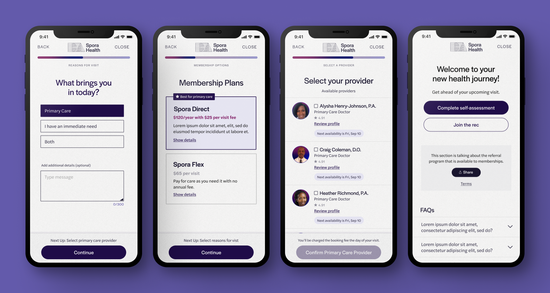
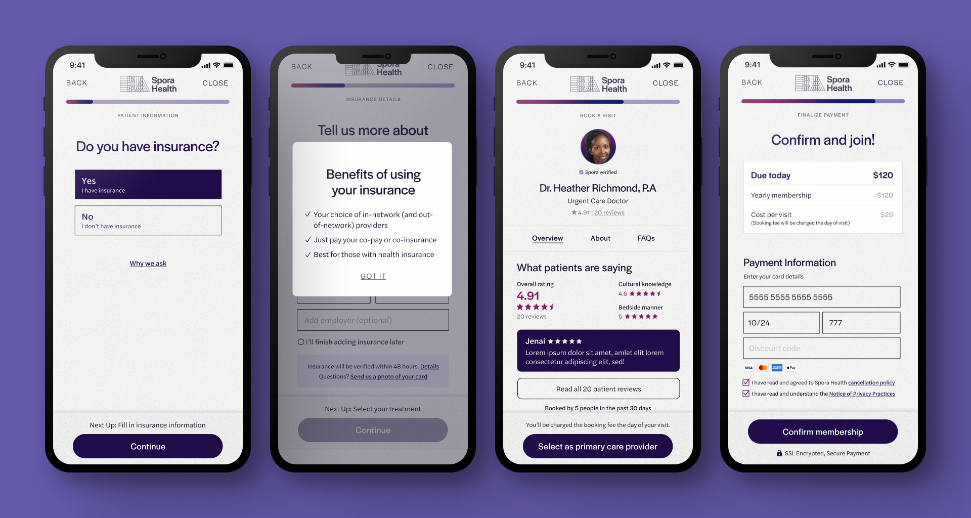
At Okay Jak, we partnered with Spora Health to redesign their marketing homepage their onboarding process with the intent to reduce barriers to access. The main goals of this project were to increase conversion and lead capture rates, while delivering the right information to the right people at the right time.


HOW WE GOT HERE —
The telehealth industry has seen a significant surge in demand over the past few years and is expected to continue growing. Due to the COVID-19 pandemic, virtual care has been critical for many individuals who want and need to access health services remotely. However, the challenge remains in creating an efficient and user-friendly system and onboarding flow that enables patients to quickly and easily connect with healthcare providers.


THE PROCESS —
We conducted extensive research to fully understand Spora Health's customers. Our goal was to identify different types of customers, uncover their pain points, and understand what motivates them. Through careful planning, thorough auditing, and rigorous user testing, we created a streamlined and user-friendly experience.
We revamped the existing design to make it visually appealing and highlight Spora's unique offerings in the telehealth industry. Our aim was to show potential Spora patients how easy and intuitive their experience would be, emphasizing the value of becoming a member.
By utilizing insights from our research, we developed a solution that gives users a clear understanding of the benefits of Spora Health and encourages them to sign up.
CHALLENGES & HIGHLIGHTS —
The original onboarding experience of Spora was unfocused, overwhelming, and visually cluttered. We recognized the significance of the funnel in engaging potential users, understanding that its implementation can determine conversion success.
A key challenge we faced was Spora's bold and highly saturated color palette. While this set them apart from competitors and showcased their distinctive perspective in the healthcare industry, it often overshadowed their content. To address this, we opted for a restrained approach, utilizing a single bold hue from their palette. We made the call-to-action buttons visually striking and incorporated subtle tints of their other colors, prioritizing readability and accessibility. Our aim was to maintain an uncluttered and intuitive process for users, while remaining faithful to Spora's brand identity and voice.


THE HOMEPAGE ASK —
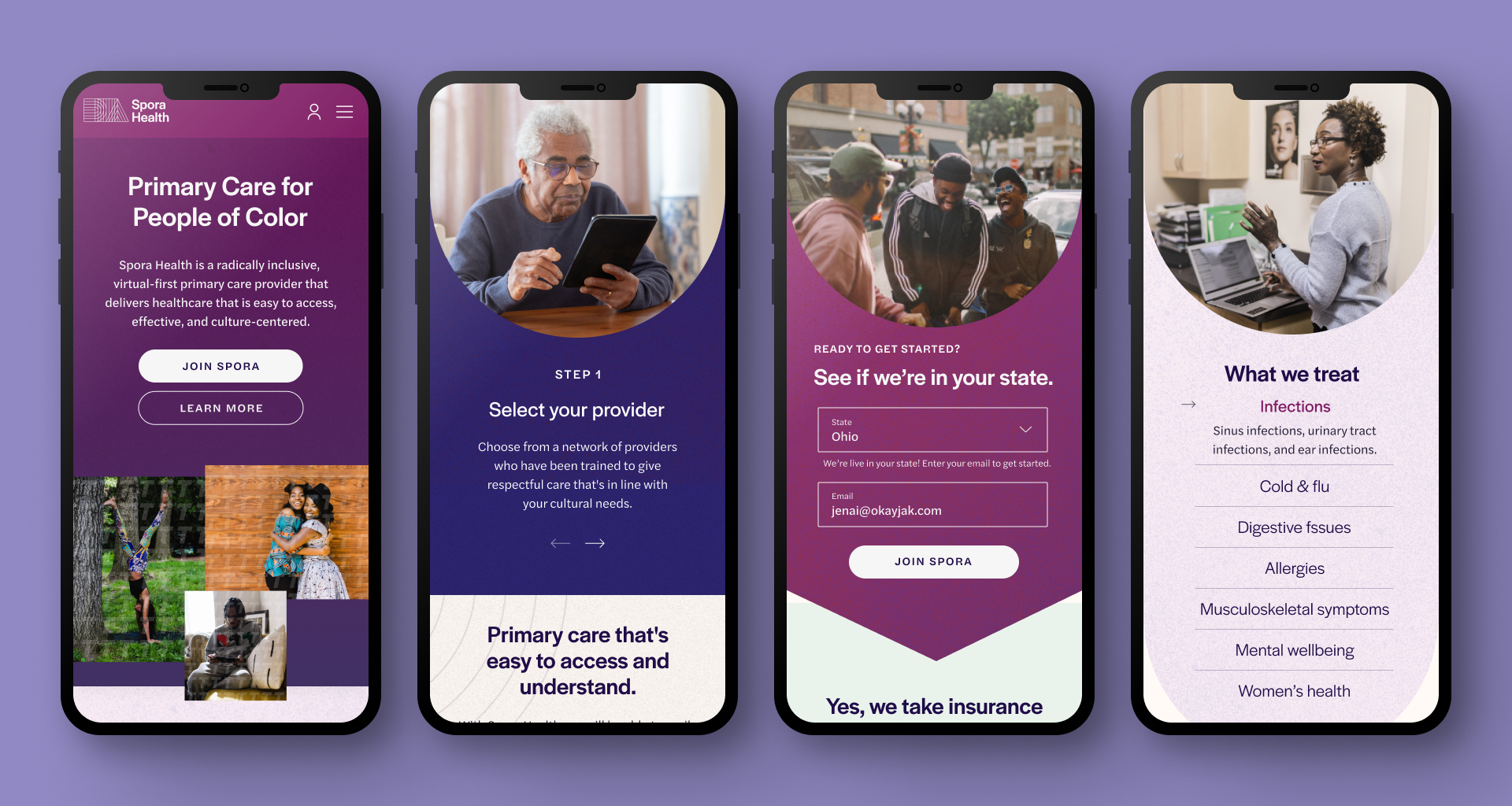
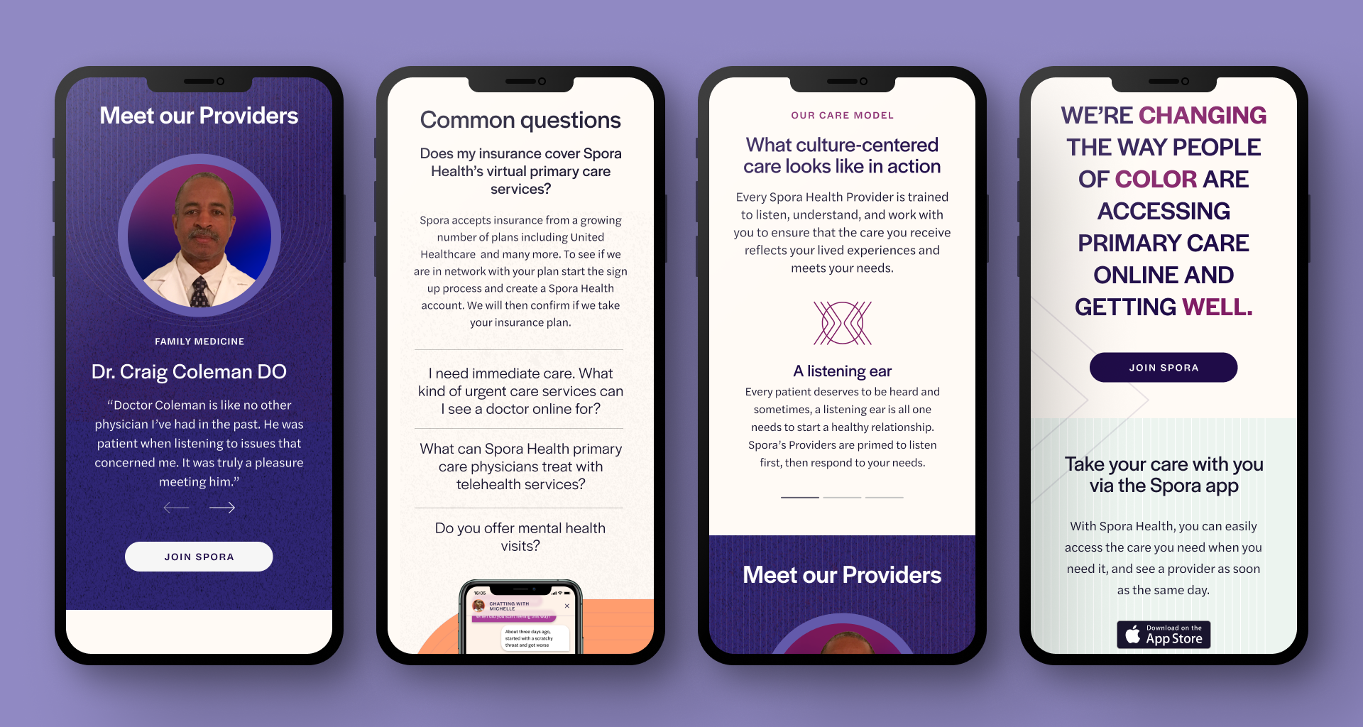
If we were to keep the UX, grid system and branding intact, how can we maximize our current assets to create a new visual story on the homepage?
We collaborated with Spora Health to revamp their homepage, crafting a modern and visually cohesive design that authentically represents their unique position as a modern health-focused company.


WHAT WE LEARNED —
Healthcare is already complex, and when cultural competency is added to the equation, it becomes even more challenging. However, the significance of this work in advancing our broader healthcare systems cannot be overstated. In the digital age, healthcare has become an indispensable aspect of daily life, making culturally competent care a critical and life-saving necessity for many. Our collaboration with Spora Health has reinforced the importance of striving for a world with greater accessibility and inclusivity, and we are grateful for the opportunity to contribute to this mission.


